
Have you heard of ”Interior-Coordinator”?
Interior Coordinator is a professional who uses various forms of decoration such as furniture and lighting to create an aesthetically pleasing living space.
While this qualification is not required in property management, the knowledge of interior design can come in handy when considering the operation of furnished rental apartments and lowering vacancy rate with home staging.
Moreover, this is significatly crucial in the case of renovation.
Make your property more appealing by home staging
We all know the importance of first impression. It is proven that 83% of people’s first impression is determined by what they see. Therefore, it is crucial to make an apartment look spacious and pleasant when designing or remodeling. Not only is floorplan important, common area and exterior of the building also determine customers’ decision in living there or not.
However, it is costly and difficult to modify a floorplan or remodel a room. A fast and relatively low-cost solution will be home staging your room. Home staging is one of many ways to lower vacancy rate.
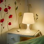
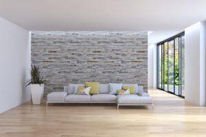
<Furnished and decorated room> Placing a sofa and coffee table with decoration improves a room’s impression and provides customers with a visual image of living.
Home staging not only improves first impression, but also helps create a visual image of living in the room. Since tenants move in with a clear image, the risk of short-term cancellation of a lease lowers as well.
However, just placing furniture does not always lead to better impression. Creating a space which tenants want to live in is the key.
To do so, you must know the basic rules of ”color”.
Using Advancing Color and Receding Color
First of all, color can be divided into two categories based on the presence or absence of color – chromatic and achromatic colors.
They can be further categorized based on its lightless and saturation.
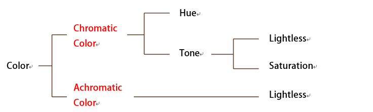
Chromatic colors, are colors with saturation such as red, green and blue, in contrast to achromatic colors (black, white and grey). This type of color is effective in creating a positive and lively image. Among chromatic colors, are advancing color and receding color.
Advancing colors are warm tone colors such as red, oragen and yellow. They appear to come towards you. On the other hand, receding colors are cold tone, darker colors such as blue and dark green. This kind of colors appear to go away from you.
Being that said, having a wallpaper with receding color can make a room seem more spacious than it actually is. However, a room can have a gloomy impression if the luminance is too low.
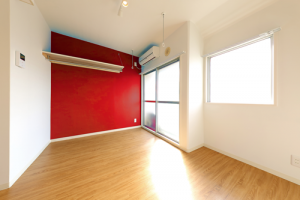
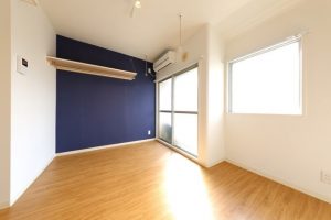
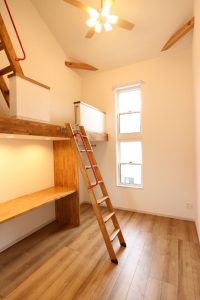
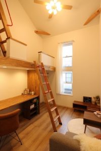
<Difference between advancing and receding colors> Pictures taken at the same room with same angle. With advancing color (red), the room seems to be more claustrophobic. While the room with receding color (blue) seems to be more spacious.
If you would like to make your room look bigger than it is, the use of receding color wallpaper will be effective. However, if you would like your room to look welcoming and lively, the use of advancing color (red) will be your choice. When deciding which color to use, always consider area and floorplan of the room, and the target tenants.
Color of Furniture – Uniformity and Proportion
When choosing furniture, it is also important to pay attention to the color. There are two points that you should be cautious of when making a decision.
First is to avoid complementary color scheme. This is a technique using two colors which lie opposite to each other on the color wheel. The use of complementary color scheme could be difficult extremely for beginners, therefore we suggest using adjacent colors – similar colors that lie besides each other on the color wheel, before you get familiar with the coloring techniques.
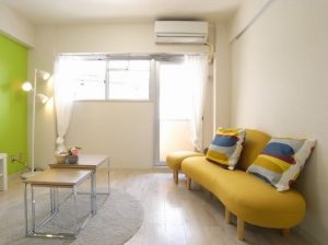
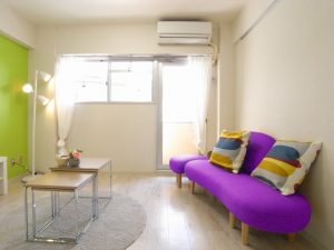
<Color difference of sofa> Placing a purple sofa with green wallpaper gives out an exotic vibe. Using similar colors (green and yellow) gives uniformity to the room.
Another point you need to pay attention to is ‘‘proportion”. The proportion of colors in a room should be 70:25:5.
<Color Proportion>
Unify ceiling, wallpaper, and floor using adjacent colors. This takes up 70% of color in the room. Pattern wallpaper contributes 25% of the color, and cushions with vivid color contribute 5% of all colors in the room. The use of vivid color textiles adds a punch and compliments the ceiling, wallpaper and floor.
The use of color in wallpaper and furniture changes the impression of a room. In Japan, there is a saying called ”Artistic Autumn” as most art exhibitions are held in fall. Now may be a chance to learn about art and color in these art exhibitions!